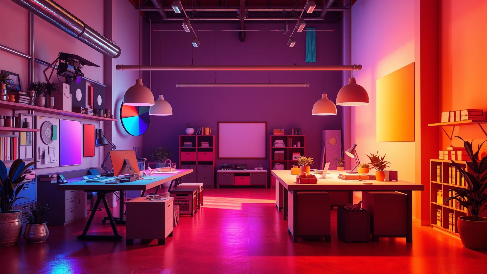
Choosing your website’s color palette is one of the most important steps in web development because colors directly affect how users feel and how they take action. A wrong choice of colors can make visitors leave quickly, while the right palette improves trust, readability, and conversions. Small business owners often underestimate this, but colors create the first impression of a website even before text is read. A jewelry e-shop needs soft classy tones, while a food delivery app needs bright energetic shades. In this article I will explain how to choose an effective website color palette step by step.
Why color palette matters in websites
Colors are not just decoration. They influence mood, emotions, and decisions. For example, red grabs attention and is used on buy buttons. Blue creates trust and is common in banks or tech companies. Green is linked with health and natural choices. If you randomly select colors without strategy, your site may look unprofessional and confuse visitors. With a proper color palette, the website communicates brand message, helps easy navigation, and improves ROI from ads or SEO traffic.
Basic color psychology for websites
- Red – Action, urgency, passion. Good for discounts and special offers.
- Blue – Trust, security, calm. Best for finance, education, technology.
- Green – Nature, growth, health. Useful for food, wellness, eco-friendly brands.
- Yellow – Energy, happiness. Works well for promotions and children-related products.
- Black – Luxury, power. Often used for fashion, jewelry, premium services.
- White – Simplicity, clarity. Used as background to keep focus on content.
How to choose your website’s color palette
Step 1: Start with brand identity
Think about what your business represents. A yoga studio should avoid neon colors and may focus on calm greens and light blues. A fast-food app can use red, yellow, and orange to create appetite appeal. Your brand values guide your palette.
Step 2: Select a primary color
Choose one main color that represents your brand. This should appear in logo, main buttons, and headings. Example: a courier business may use blue to show trust.
Step 3: Add secondary colors
Pick 2–3 support colors to maintain balance. They should not overpower but complement the main color. These are often used for background, highlights, and section dividers.
Step 4: Use neutral base
Always keep white, grey, or black as base colors for backgrounds and text. They make other colors stand out and improve readability.
Step 5: Check accessibility contrast
Many sites fail because colors look stylish but text is hard to read. Use tools like WAVE contrast checker to ensure proper readability. Good contrast is essential for both user experience and SEO.
Mini guide: Tools for choosing color palette
- Coolors – Generates random combinations with export options.
- Color Hunt – Provides community-created palettes perfect for beginners.
- Adobe Color – Advanced tool to create harmonious schemes.
- Canva Palette Generator – Upload an image and extract colors directly.
Table: Best palettes for industries
| Industry | Suggested Palette | Effect |
| Healthcare | Green, blue, white | Fresh, safe, trustful |
| Food delivery | Red, yellow, orange | Energetic, creates appetite |
| Jewelry/fashion | Black, gold, white | Luxury and elegance |
| Education | Blue, grey, white | Professional and reliable |
| Local shops | Bright variations like red, green with neutral tones | Welcoming and simple |
Indian business examples
A mithai shop in Indore launched a site with dull grey shades. Users did not feel hungry vibes, so orders were less. Later, adding saffron orange and red created an energetic festive mood and online sales doubled. Similarly, a coaching institute in Delhi that originally used multiple random colors looked confusing. After shifting to blue and white theme, the site became professional, leading to more admissions.
How color affects ads and conversions
On landing pages for Google Ads or Facebook ads, color palette plays a vital role. A strong contrasting buy button increases clicks. Wrong color makes users scroll past offers. Even on YouTube thumbnails, color brightness drives higher click-through rate. Using the right palette improves ROI of ads, directly linking design to business success.
AI support for selecting palette
AI tools like ChatGPT can suggest brand color psychology based on your industry. Canva and Figma plugins now use AI to recommend color combinations that fit your logo. Instead of trial and error, you can instantly get a range of palettes tested by design logic. This saves time and ensures your choices are backed by design strategy.
Automation and consistency
Web developers can automate color consistency with design systems. For example, using Figma components ensures the same colors apply across all pages. With tools like n8n, updates in palette can automatically sync design documentation or notify development teams in Slack. This avoids mistakes where one page uses wrong shades, keeping brand image consistent.
Mini guide for beginners: Testing your palette
- Check how colors look on both desktop and mobile
- Print a sample to see if it looks professional offline
- Show palette to 5–10 users and ask how they feel about it
- Test buttons with A/B campaigns using Google Ads small budget
- Adjust tones if many users complain about readability
Case study: Freelancer success
A freelancer from Pune was designing a website for a gym. Initially, the client wanted bright yellow with green as main palette. Visitors did not take it seriously and membership conversions were low. The freelancer convinced them to use black, red, and white instead, which matched gym lifestyle energy. That small change increased sign-ups by 40 percent. This real story shows how website color directly affects business ROI.
Extra benefits of right color palette
- Improves readability and keeps bounce rate low
- Strengthens brand memory in customer mind
- Supports better ad targeting outcomes
- Makes website look modern and professional
Niranjan Yamgar final thoughts
Choosing your website’s color palette is not a random decoration job, it is a business decision. With the right mix of brand identity, color psychology, AI support, and consistent execution, your site can look beautiful and also convert visitors into buyers. I always tell clients that colors are your silent salesman working behind the design. If you want a full team that not just designs but ensures results with ads, SEO, automation, and growth strategy, you can always connect with India's trusted partner for web success and get expert guidance for your business journey.